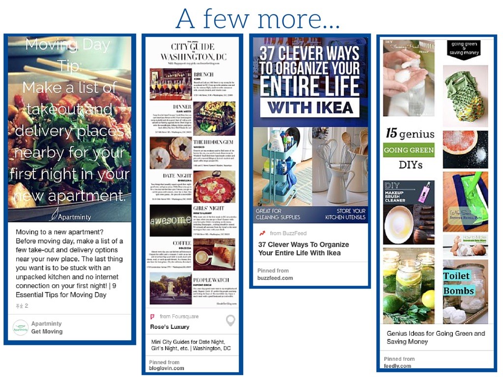
There’s been plenty of discussion over the past year or so about the value of using Pinterest for business. With the addition of Rich Pins, major retailers and specialized artisans alike have found a new platform to connect with shoppers, but what about the rest of us? In industries where we can’t definitively measure the direct revenue from social media platforms, how do we begin to define success on Pinterest and demonstrate the value to our companies?
One big question we keep coming back to in the multifamily world is this: are people actually shopping for apartments on Pinterest? While I cannot say that this platform is top of mind for renters when they begin their search, I can say with great confidence that the rental community has a strong Pinterest presence.
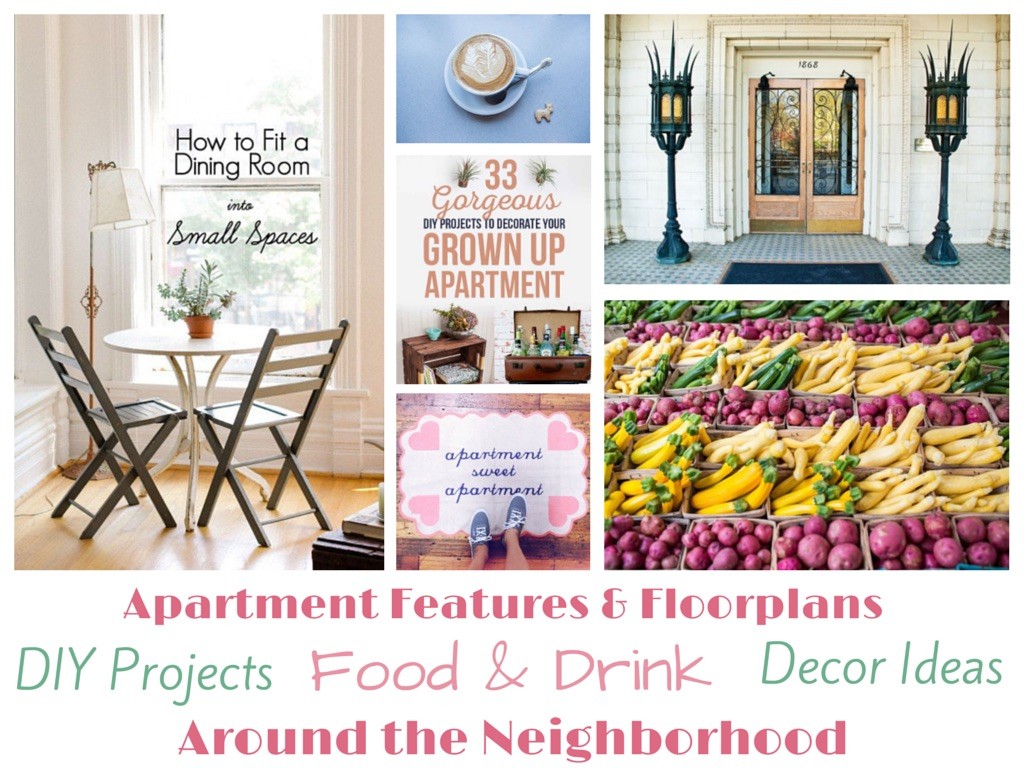
The way I look at it is this: people may not be coming to Pinterest to search for their next apartment, but what are the things on your mind when you know a move is in your future? Décor ideas? DIY projects? Packing and moving tips? Information about the neighborhood or city they’re looking to move to? These are all things we’re experts on in one way or another, so why shouldn’t we be the ones providing this info? If you can capture their attention with this type of content, they’ll soon be clicking through to your site to see what else you have to offer, and maybe even to find their next home.
So what can you do to increase your chances of capturing the community of renters and apartment hunter who are active on Pinterest? Whether you’re brand new to the platform or ready to give your account a facelift, we’re going to show you the steps you can take right now to become a Pinterest master.
Optimizing Your Pinterest Profile
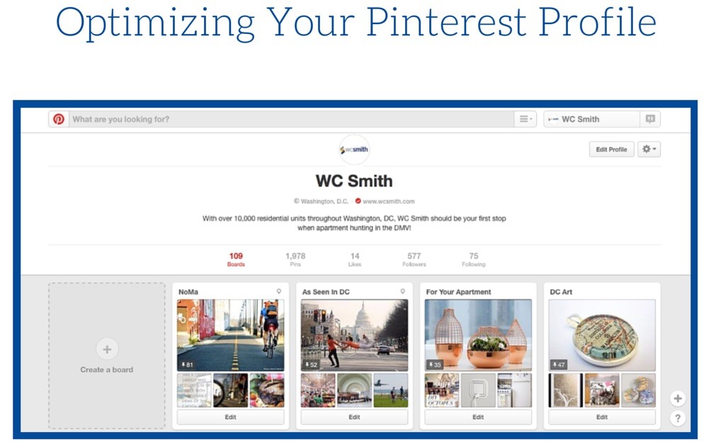
Upload a profile picture
- Pinterest is a social channel and we’re working to establish ourselves as a trusted and recognizable brand so don’t skimp on the photo
- This will display as 153 x 153px, so a 200 x 200px photo is recommended.
Create a description
- Help pinners understand who you are and what you have to offer by adding a clear and brief description
- This description is searchable, so be sure to work in a few keywords as appropriate, but no keyword stuffing!
- If you operate in a specific city or state, include your location in the description to capture your local community
Add a location
- Yes you did this in the description, but Pinterest also offers a field to add a city and state. Do it.
Verify your website
- You’ll also want to have a verified website link in your profile; visit the Pinterest for Business page for a step by step of how to do this.
Rearrange Your Boards
- Take advantage of the ability to click and drag boards around within your profile page to showcase your best boards at the top. These may be the boards with the most pins and repins or the ones that best showcase your area of expertise. If you’ve already created boards, take look to see how they’re arranged now. If you’re just getting set up, come back to this step.
Optimizing Your Pinterest Boards
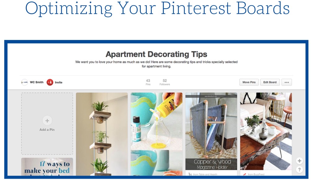
Pick unique and descriptive board titles
- Your board titles are searchable as well, so if you have a board titled “apartment decor”, anyone search for those terms could potentially see the pins from that board in their search results, regardless of the pin descriptions.
Add pins to your boards
- You want to aim for a minimum of 10 pins per board. If you find yourself approaching 150, 200 pins on a board, I want you to think about if there is a way to break that board down into smaller categories. By taking a recipe board and breaking it down into “quick breakfast options” “lunch recipes” and “dinner in your apartment”, you’ll be able to cast a wider net and capture a bigger audience.
Add a board map
- When editing your boards, add a map if it makes sense for that topic. We love using the new-ish map feature for our city profile boards to help give viewers a feel for the area and community flavor.
Add a category
- Choosing a category for your board helps the pins on that board show up when someone is browsing that category. There will be board topics that simply don’t match any of the categories offered, but most often you can make something fit. For example, we use the category “Architecture” for our property boards since they feature photos of our buildings exterior architecture, interior details and unit floorplans.
Select a cover photo
- Once you have a good number of pins on your board, update the cover photo. Pinterest will automatically select one at random for you and the layout of the board cover photo is landscape, so take the time to pick a pin that presents well in those size restraints and that does a good job representing what type of pins to expect from that board.
Don’t forget to save your changes!
Optimizing Your Pins
No two pins are alike and there are many different ways to find success on Pinterest, but we have a few suggestions for creating pins that help get you noticed. Keep in mind that not every pin will follow every rule and that’s ok. When you focus entirely on following the rules, you lose the authenticity in the flavor of your brand.
Create content that is useful, interesting and/or entertaining
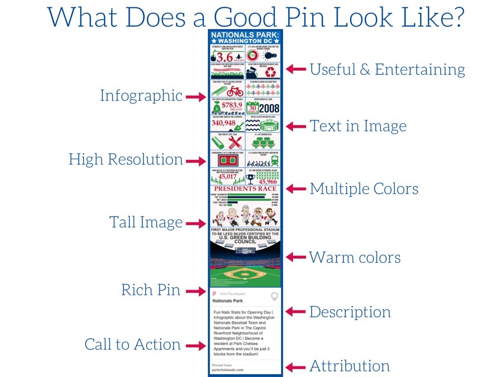
- We had this infographic created for an apartment community that is 3 blocks from Nationals Park in Washington, DC. For opening day, they released a blog post with these fun Nats stats and highlighted their proximity to the stadium.
Use text in your images
- Whether it’s a quote, blog description or an infographic, using text in your image helps confirm what the image is all about. Often when pins are repinned, the descriptions get changed or deleted all together, so having a basic description in the image itself helps ensure that viewers continue to understand what they’ll be clicking through to.
Use high-resolution images
- Try to stick with images that are no less than 600px wide to ensure images appear clear and not blurry.
Use tall images
- With the scrolling grid-style layout on Pinterest, tall images really capture the eye for a longer period of time. A 2:3 aspect ratio is ideal, so if you’re image is 600px wide, 900px tall would be ideal. This is something to keep in mind when creating your own pins since you can create your own dimensions with tools like Canva (more on that later).
Use bright, warm colors
- Studies have found that warm, rich colors are repinned more often than cool, muted colors, and using two or three bold colors in one pin really helps it stand out. Again, consider your brand when curating your pins – my eye prefers soft neutral tones and I know I’m not alone there, so don’t be afraid to mix it up a little bit.
Avoid images with faces
- While other platforms (like Instagram and blog featured images, for instance) tend to do well with images that show faces, Pinterest users prefer to repin images without faces. My best estimation for how this logic works is similar to the logic we use when staging a home or apartment for sale: people want to be able to picture themselves in the space. Whether they’re looking to upgrade their living room decor, learn more about a travel destination or take on a DIY project, the less human distraction the better.
Rich Pins
- A fairly recent addition to Pinterest, rich pins are ones that provide extra info right on the pin itself and include pins of recipes, apps, movies, articles, products for sale and places. For our purposes, adding locations with Foursquare integration creates a rich pin that we can use with our boards with maps. Rich pins present better because they provide valuable information and link directly to the source. If you have a small portfolio or have an onsite team member that handles your social media, you may want to consider creating product pins for your available units. Product pins allow you to add a price to your pin so renters can effectively shop for their next place on Pinterest. The best part? If someone has pinned your available unit, they will be alerted via email if the price drops, reminding them that something they’ve already indicated interest in still available, and now for a better price. You can learn more about creating rich pins here.
Description
- Never neglect the description. This is another opportunity to show up in the search results and give viewers and idea of what they can expect to see more of when they click through to the source. Descriptions should be about 200 characters ideally and just like your board and profile descriptions, they should be clear and concise with a few keywords worked in. As always, remember that you are writing for humans, not computers at the end of the day.
- Use this opportunity to create a call to action when appropriate. In this example, the call to action is a soft sell, informing pinners that Park Chelsea apartments will be just 3 blocks from Nationals Park, with the pin linking back to the property blog.
Attribution
- Finally, always make sure that your pins link back to their original source. If you’re pinning directly from your website, this will happen automatically, but if you’re uploading content, be sure to go back and edit the pin to add the correct url source, and if you’re repining someone else’s content, click through to make sure the link brings you where it is supposed to. You don’t want to be sharing bad info with your audience- remember, we’re trying to establish trust and authority here.
Timing
- If you’re going to take the time to pin, do it when your pins will actually be seen. The most active hours on Pinterest are Fridays at 3pm and Saturdays at 8am, and again between 2-4pm and 8-11pm. Avoid posting anything on weekdays between 1-7am and 5-7pm, these are pretty dead zones and your efforts will not give you much reward.
Toolkit
There are a few tools we use all the time to help create and optimize our pins:
- Tailwind is an incredible new tool that allows users to schedule out their pins to post at a later time. As if that wasn’t amazing and time-saving enough, it also analyzes your account’s audience and suggests the best times to pin and offers personalized suggestions for how to improve your profile, pins and boards.
- Canva is one of our favorite free tools to use when creating our own visual assets. Canva offers awesome templates and design elements to help create your own eye catching visuals. Use it to overlay an image with an inspirational quote or moving tip, create a simple infographic or simply insert your logo onto an original image.
- Piktochart and Venngage are both tools to help create photo collages using simple templates.
- Latergramme and Schedugram are both tools that allow you to schedule Instagram posts
- Crew and Fiverr are both marketplaces where you can enlist the help of a professional to create content or visuals for you.
