As a marketer, you work so hard to generate traffic for your on-site teams. Blog posts, reputation management, Craigslist, ILS advertising, etc. So your team finally gets a prospective resident into the property and then what? Hopefully, they take your prospective resident to see a model apartment.
When is the last time you walked through your model and looked at it through your target customer’s eyes? Is it over-designed to the max with a bunch of furniture and decor that your target audience could never afford? Has it been so long since it was touched up it looks like a #TBT picture? What about the model is helping your on-site team sell their community to the client and close the deal?
With these questions in mind, we put the fate of our outdated model in the hands one of our favorite interior designers, Susan Norton from A Different Eye. We challenged Susan to not only freshen up the model, but to do it all with items that could be bought at the local Homegoods or World Market … keeping the look completely accessible to our customers. AND she had to keep all of the existing furniture. Below are the awesome before and after shots of the transformation and Susan’s reasons for the changes.
Living Room
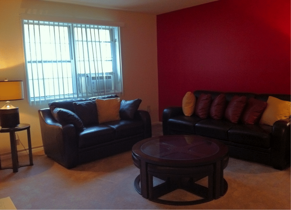

The model apartment had little life or personality. The dark accent walls caused the space to look small and chopped up, and the furniture and few accessory pieces seemed outdated and dreary.
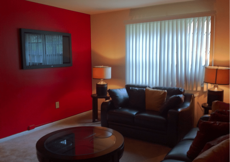
I had two goals in mind: (1) to bring a feeling of warmth and brightness to the model and create an eye-catching and welcoming space, and (2) to create this new space by purchasing reasonably priced items locally, helping potential residents to feel if they rented a similar apartment, they could easily recreate this design for themselves without spending a lot of money.
We started the renovation by reusing the major furniture pieces and selected a coordinating contemporary area rug with a dark base (keeping in mind the foot traffic) that felt up-to-date and bright.
As a beautiful accent, we added a silver rod with modern panels to the living room window which also helped to make the vertical blinds “disappear.” A soft, neutral color was selected for the walls and window treatments bringing a feeling of openness and easy flow throughout the apartment.
Lastly, the accessories were an integral part of the room’s transformation with the installation of a large mirror over the sofa making the room appear a bit larger, the addition of new eye-level lighting that was warm and bright, and the placement of beautiful decorative elements throughout to add color and richness.
Keeping the dramatic black/white color design throughout the room; added a contemporary console and coordinating accessory items.
Bedroom
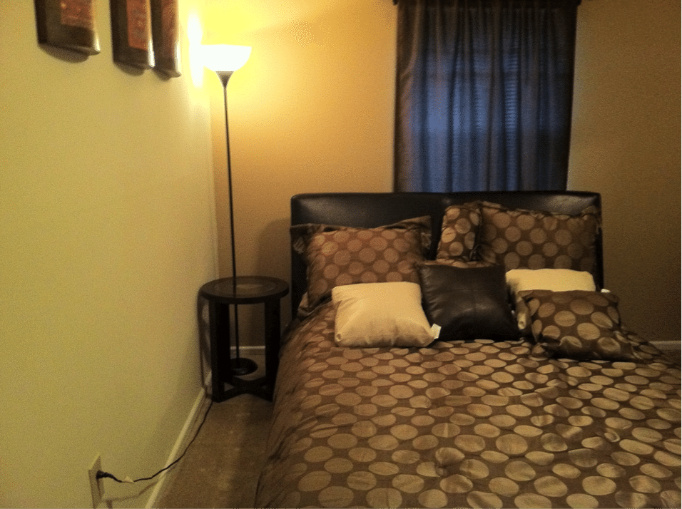
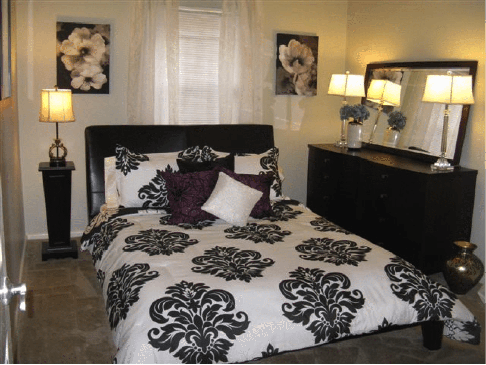
The bedroom – everything about it was dark, dreary and uninviting! New fresh and updated bedding to carry the black and white from the living room into the bedroom; added rich accent colors – deep purple and teal to really pop! Smaller side table to open the space, addition of eye-level lighting on the dresser and side table which always brings warmth to any space. Wall art selected to bring the fresh feel of nature indoors – and neutral sheer panels for a light and airy feel/look.
Dining Room
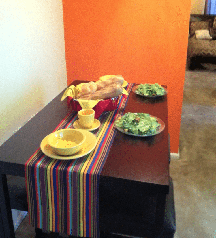
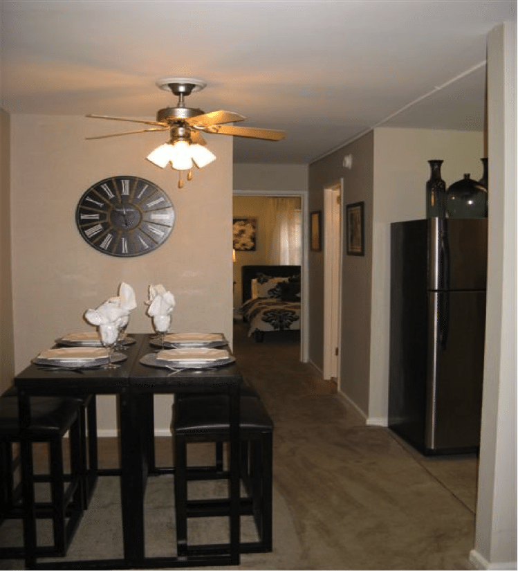
No fake food — ever!
We set the table elegantly, added a huge wall clock for interest, and placed decorative elements on the top of the refrigerator to draw your eyes up making the space feel larger.
Bathroom
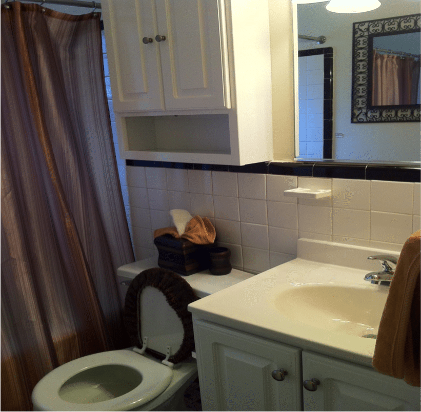
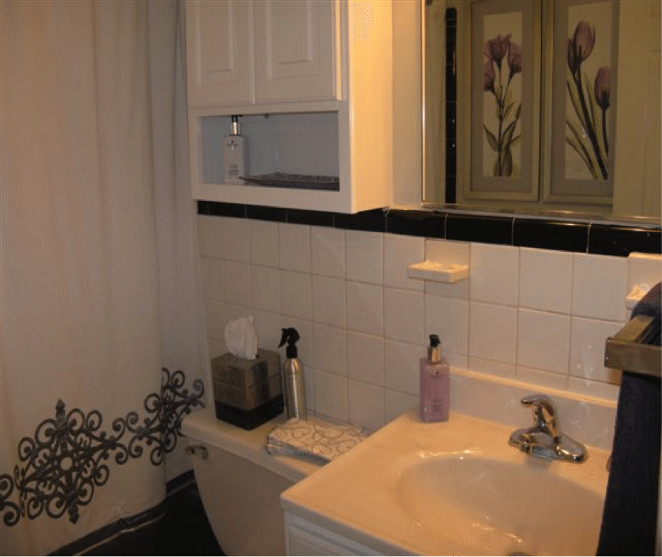
We purchased a shower curtain whose color and sophisticated pattern didn’t copy, but coordinated with the other rooms in the model; beautiful soap dispensers and guest and hand towels to bring color, and replaced the heavy wrought-iron mirror with photographs of flowers to continue the nature theme throughout the apartment.
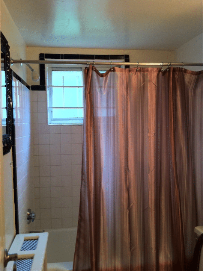
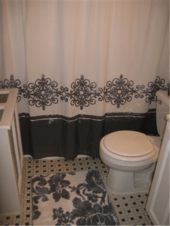
Add a rug that coordinates with the shower curtain and brings in a pattern and color from another room {in this case the bedroom bedspread} This helps create flow and fluidity in the customer’s mind.
Kitchen
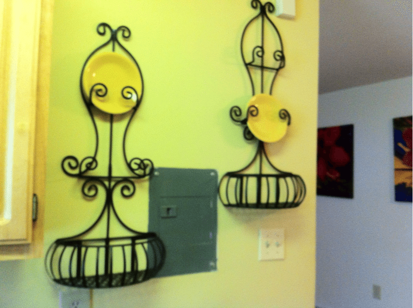
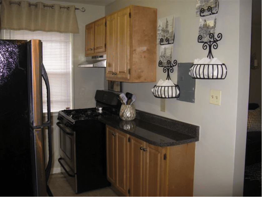
Added creative, fun accents to the kitchen to make it feel lived-in and not just staged. We swapped out the decorative plates and instead added pictures in for an unexpected accent. We also removed all of the fake food!!! {Sensing a theme?}
Ready to update your model? Here are some key takeaways:
- Pick a theme to tie the rooms together. Even if it’s just the accent color that you will use for accessories in each room.
- Keep it neutral. Forget the accent walls! If your customer hates that color you may have already lost them!
- Find your flow. Window treatments can make a world of difference.
- Lighten up. Bring lighting to eye level.
- No fake food. Ever. {We apply this philosophy to our diets, too!}
A special thank you to Susan for her input. If you would like her expertise, you can reach Susan at Adifferenteye@msn.com.
A Different Eye
17412 Macduff Avenue
Olney, MD 20832
(301) 335-5226